Interactive Tool:
How Much Coronavirus Funding Has Gone to Your State?
Case Study
The Challenge
Develop an interactive map that shows dispersal of federal coronavirus relief funding by state.
The Audience
Designed as a resource for lawmakers, journalists, press and media, researchers, and the general informed public. The tool has been picked up by various local and national media outlets. Including, but not limited to, POLITICO, Yahoo! Finance, Forbes, CBS Boston, The Denver Post, Vermont Digger, Arkansas Times, NBC Rhode Island, The Columbus Dispatch, The Gazette (Colorado Springs), and Washington State Wire.
The Solution
Trillions of dollars in coronavirus relief are being allocated to states, localities, businesses, citizens, school districts and healthcare systems as part of the necessary response to this pandemic.
This interactive website allows users to follow the money overall, per capita and by program; help determine its impact; understand why certain entities receive variations in funding; and see how much aid is left to be disbursed.
This site was designed as a sub page to the Foundations Understanding the Coronavirus Crisis site.

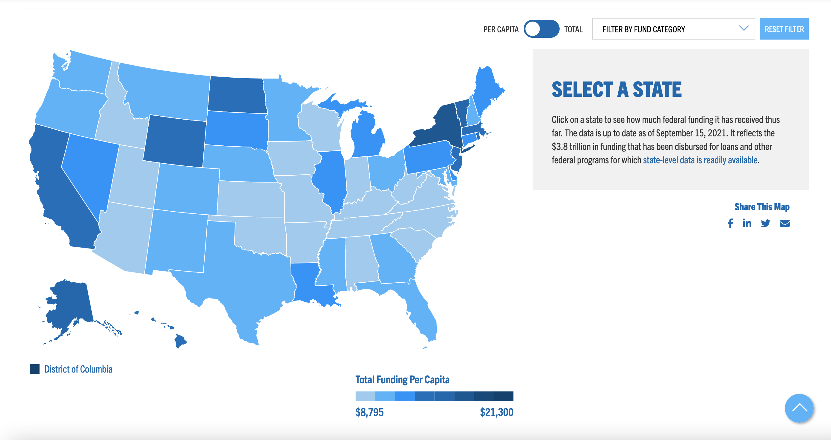
Filter by Funding Per Captia
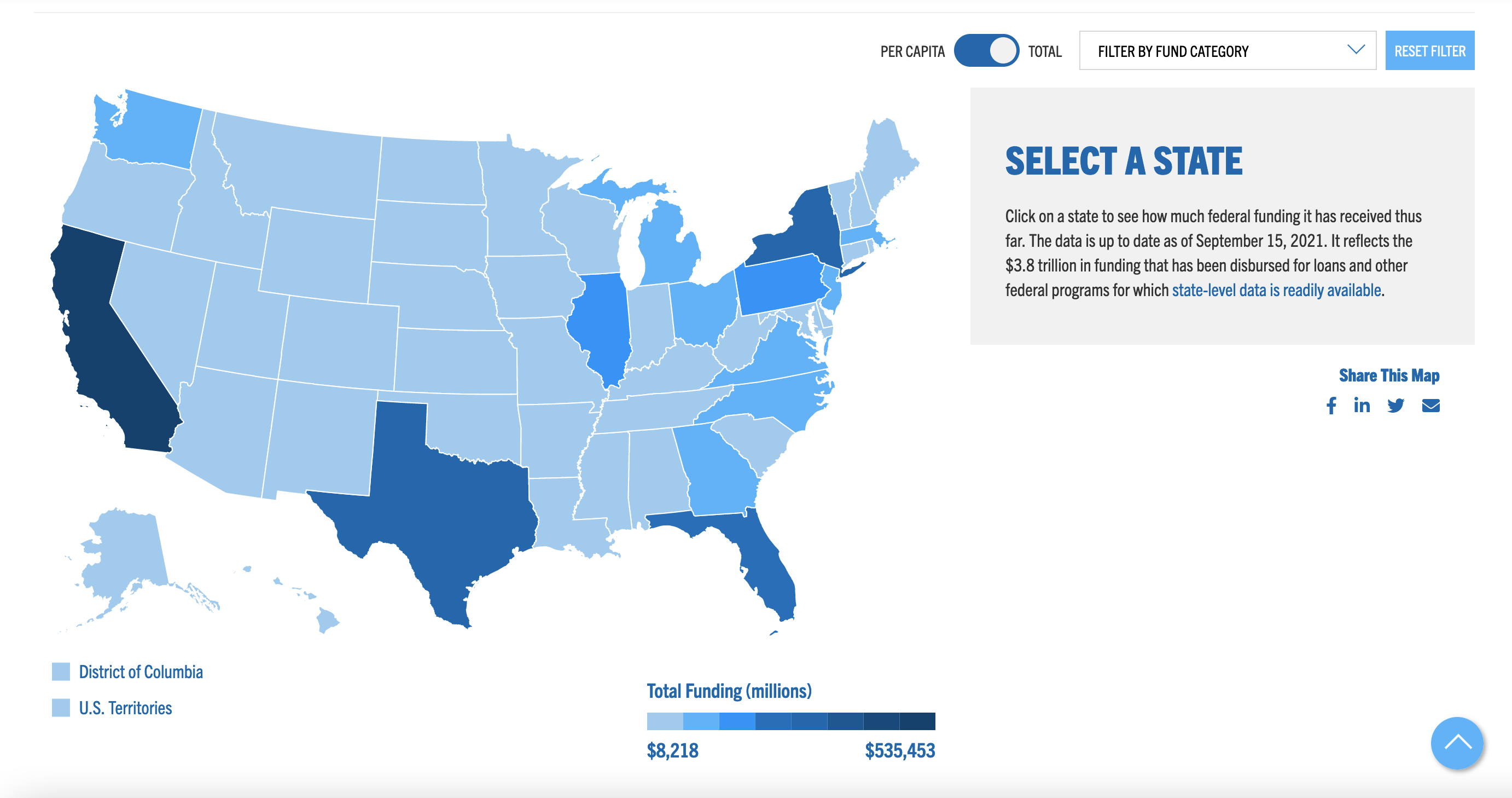
Filter by Funding Category
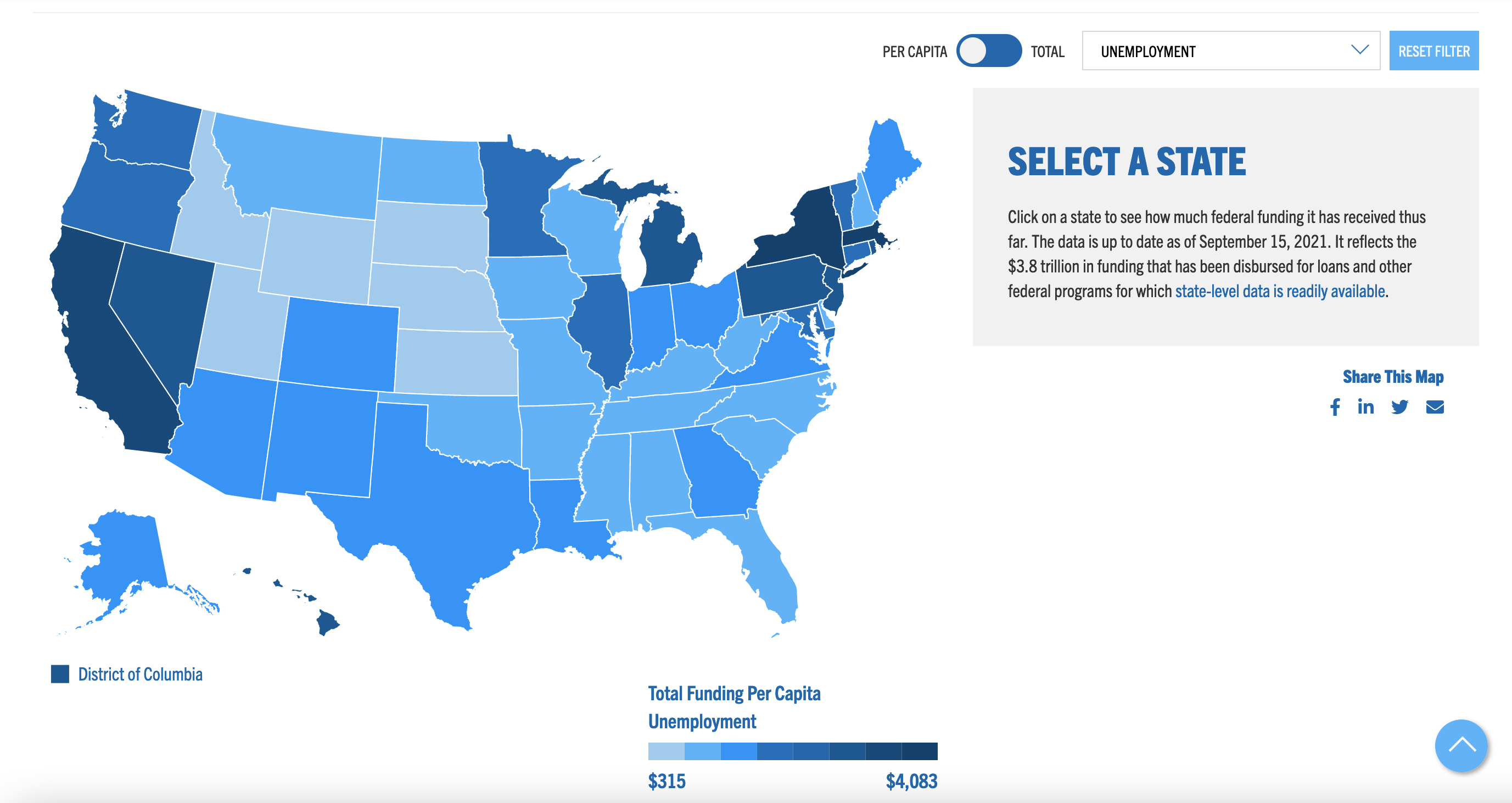
Filtered by Unemployment Funding Per Capita
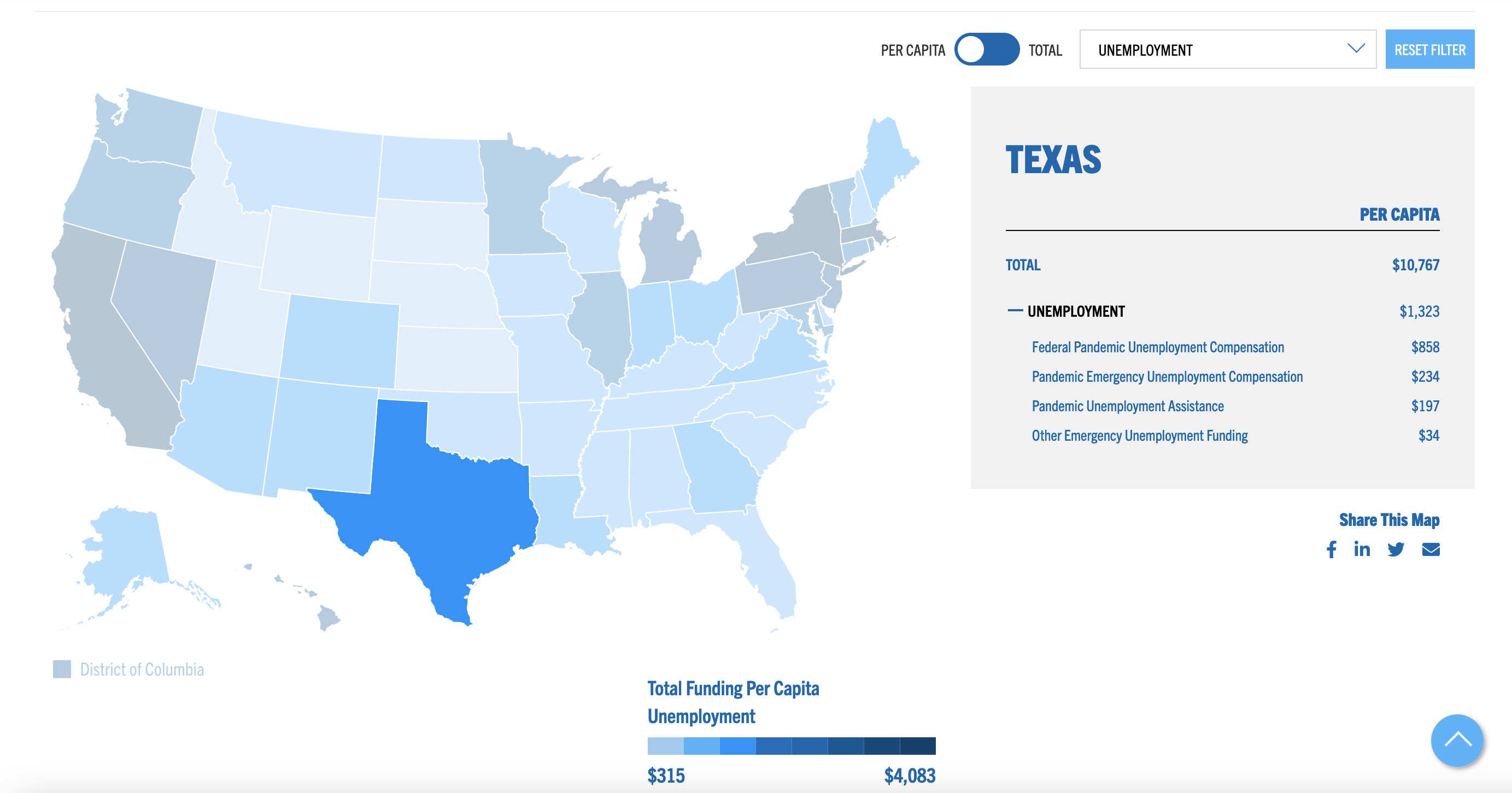
Drill Down on Individual States
Breakdown of Unemployment Funding Per Capita for Texas.
Drill Down on Individual States
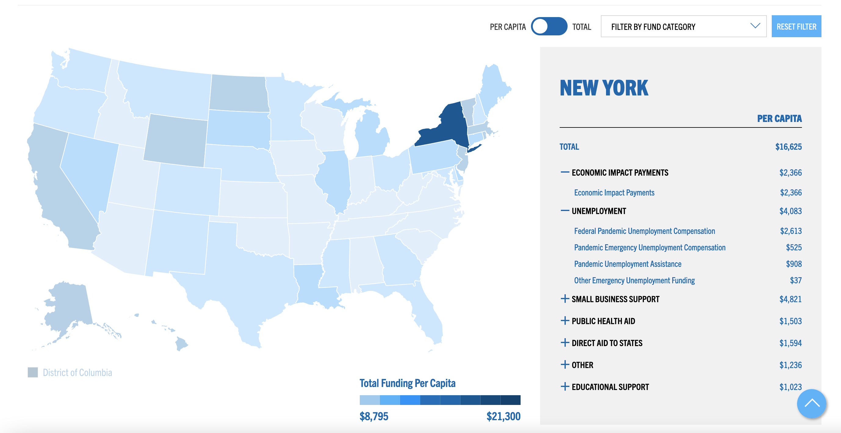
Breakdown of New York’s Coronavirus Funds Received by Category.
Drill Down on Individual States
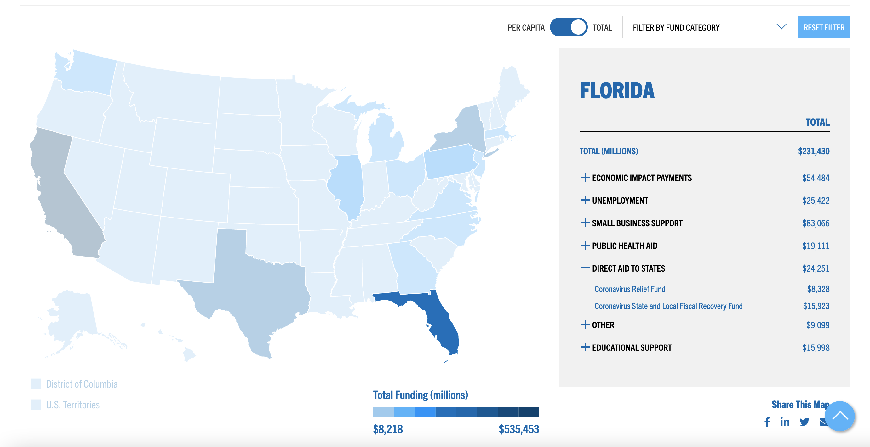
Breakdown of Florida’s Coronavirus Funds Received by Category.
Results
Launch date | September 2020
Web traffic analytics from first year.
Analytics from September 2020 – September 2021
Pageviews
Unique Pageviews
Avg. Time on Page

Interactive Map
Click to use the map and see how much federal coronavirus funding your state has received.

Sortable Table
Click to sort data by acending or decending order.

Interactive Chart
Click to see the difference between state allocation of funds from the CARES Act and the American Rescue Plan – the two largest pieces of coronavirus relief legislation to date.
