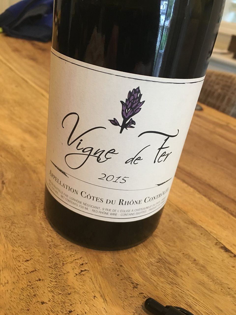
Vigne de Fer
Case Study
The Brief
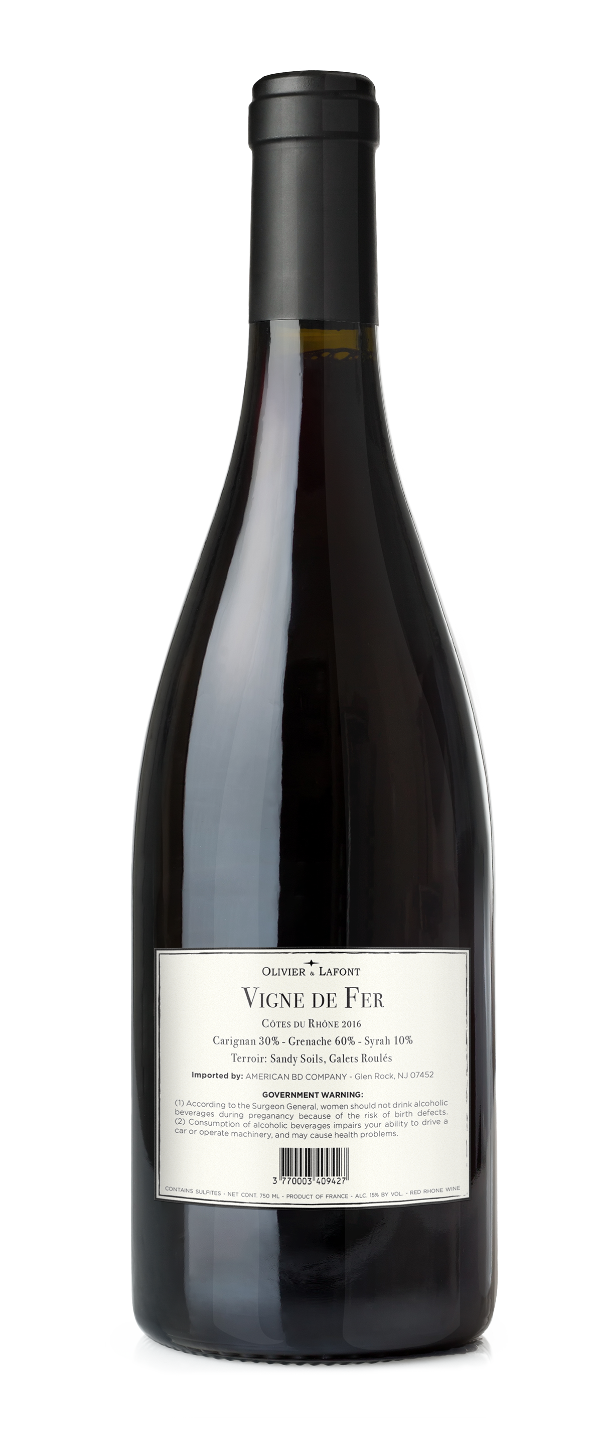
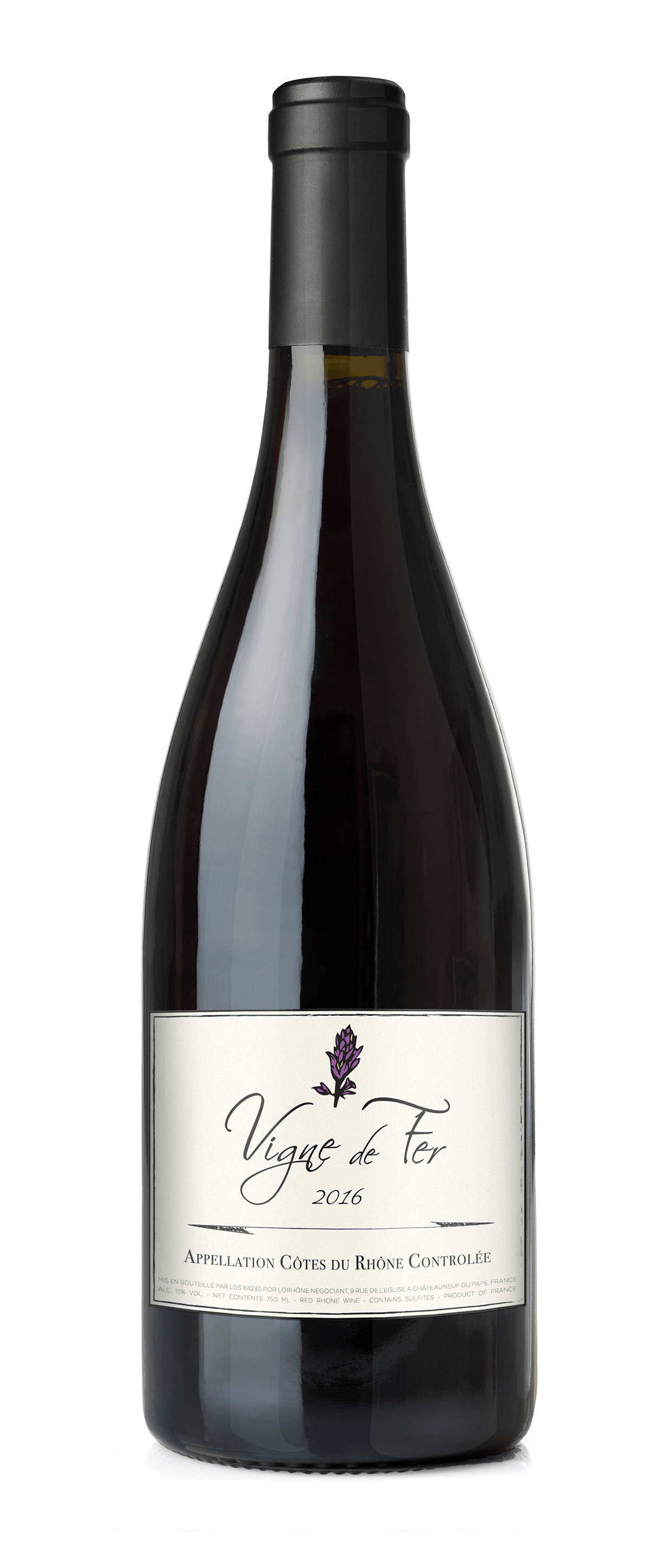
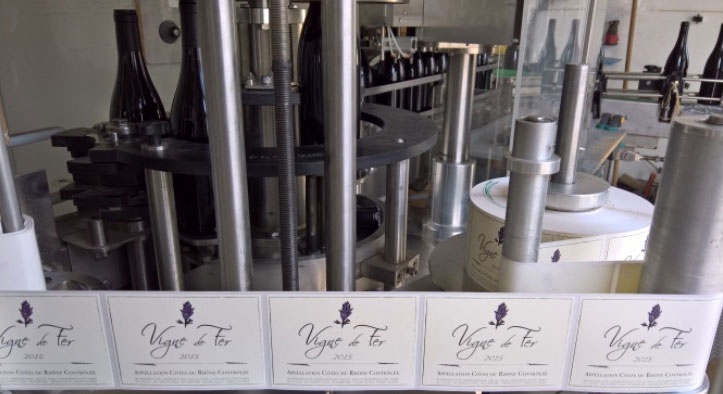
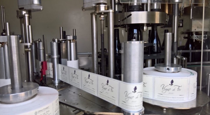
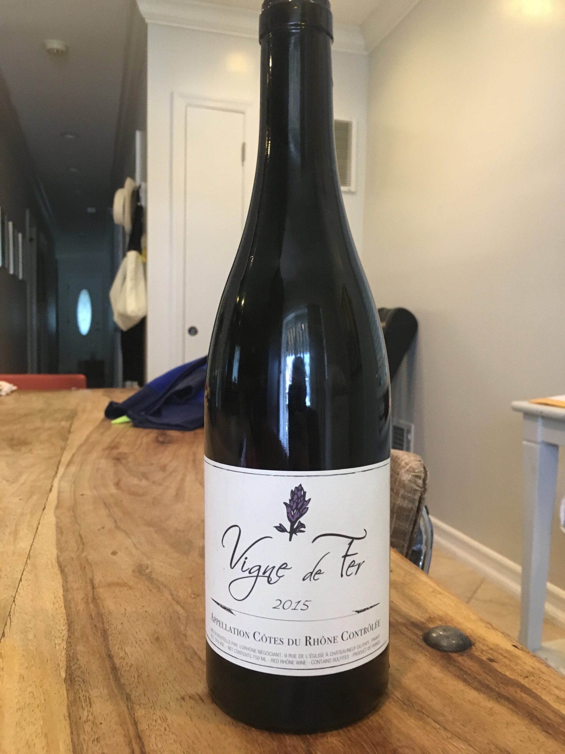
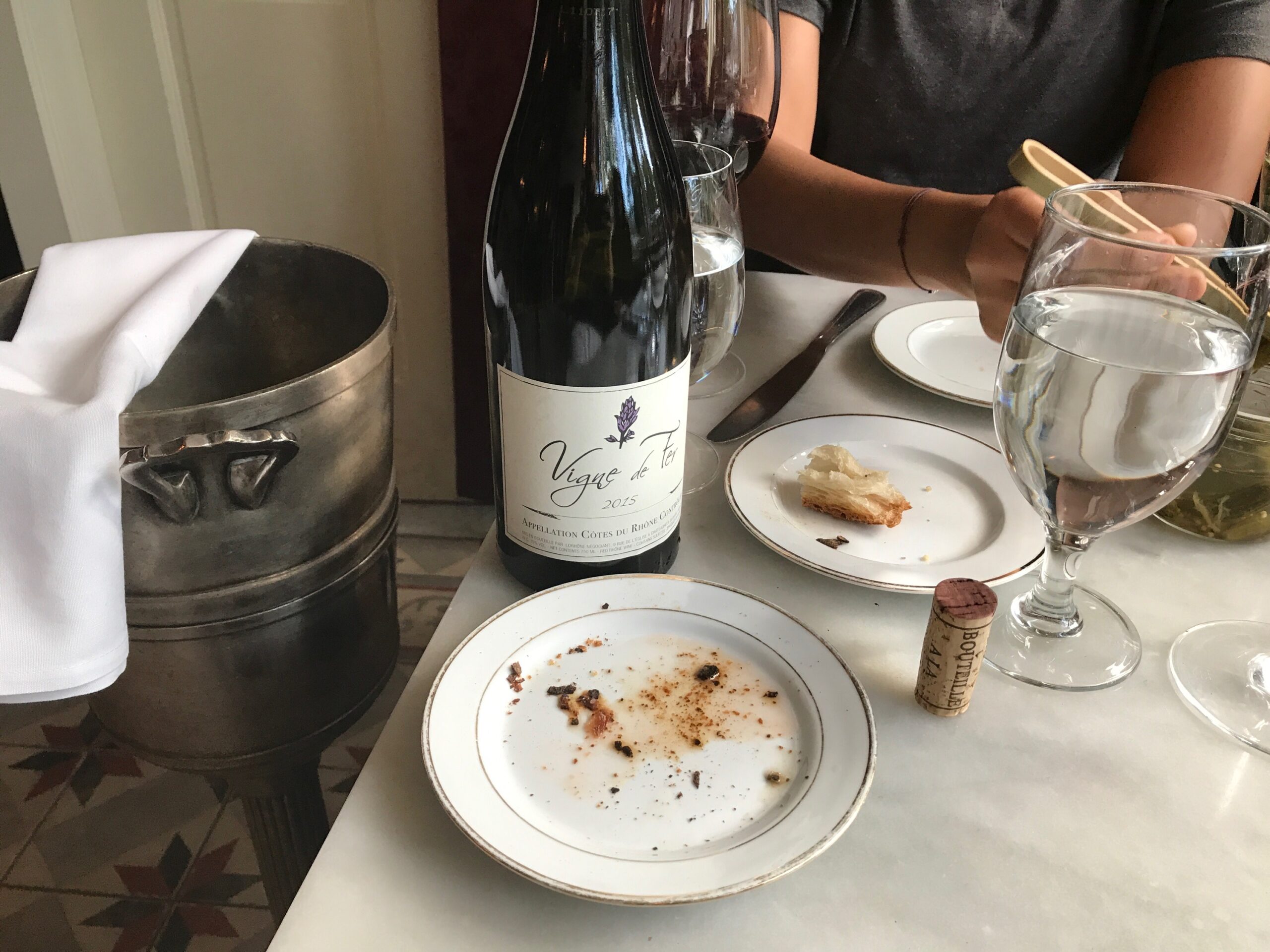
A major distributor in fine wines requested a logo, label, and packaging design for a new line of wine scheduled to be put into production in 2017. Client requested elegant, yet modern design to the French wine and brand name Vigne de Fer (previously L’equilibre).
The Process
Logo Design and Art Direction
Step 1:
Initial Sketch
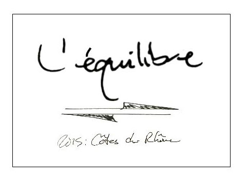
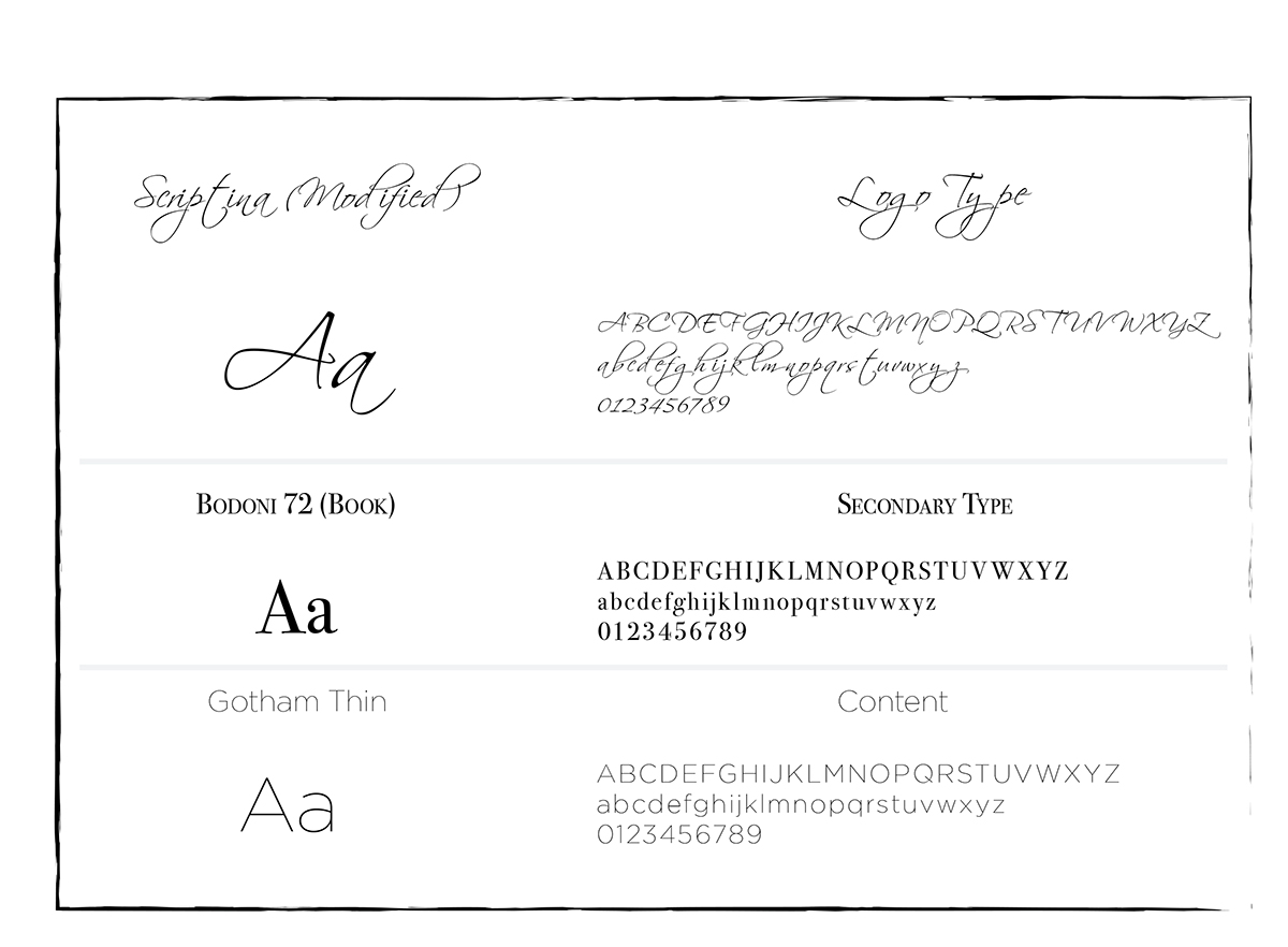
Client desired a custom hand written typography font. The arrows demonstrating the definition of the brand “L’equilibre” which directly translates to “balance.” Furthermore, from the onset the planning of the logo and branding was targeted to be a rectangular label for a traditional burgundy style wine bottle.
Step 2:
Vector Logo Illustration
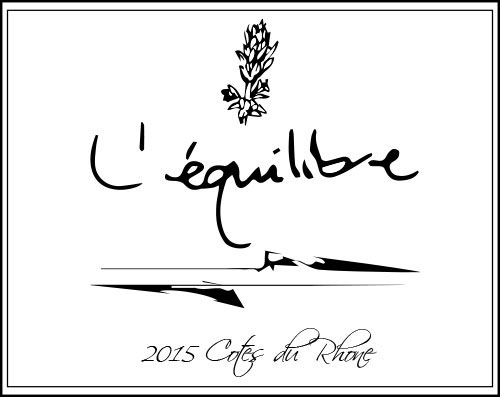
Creating a Vector illustration from sketch. Drawing a thyme flower as the logo icon (the thyme flower grows in natural abundance in the French Rhone Valley).
Using Adobe Illustrator to create a vector logo that is scaleable to any size without losing clarity.
Step 3:
Revisions and the Creative Collaboration Process
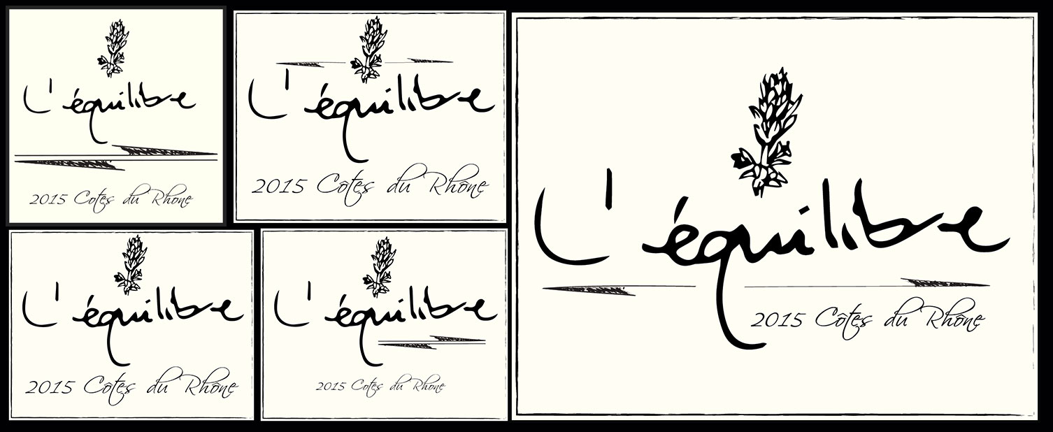
Creative collaboration with client to capture the visual identity and branding of the product. Multiple revisions and options to give the client the best possible choices in moving forward in the design process. During the stage of development, we began to think more about the packaging and product design application of the logo. The ivory color was added as a background to add more class and distinction to the brand. The arrows were re-sketched in Adobe Illustrator. We began to play with arrangement and the type of the type of wine. Displaying different degrees of optical kearning, placement and accent types.
Step 4:
Final Revisions
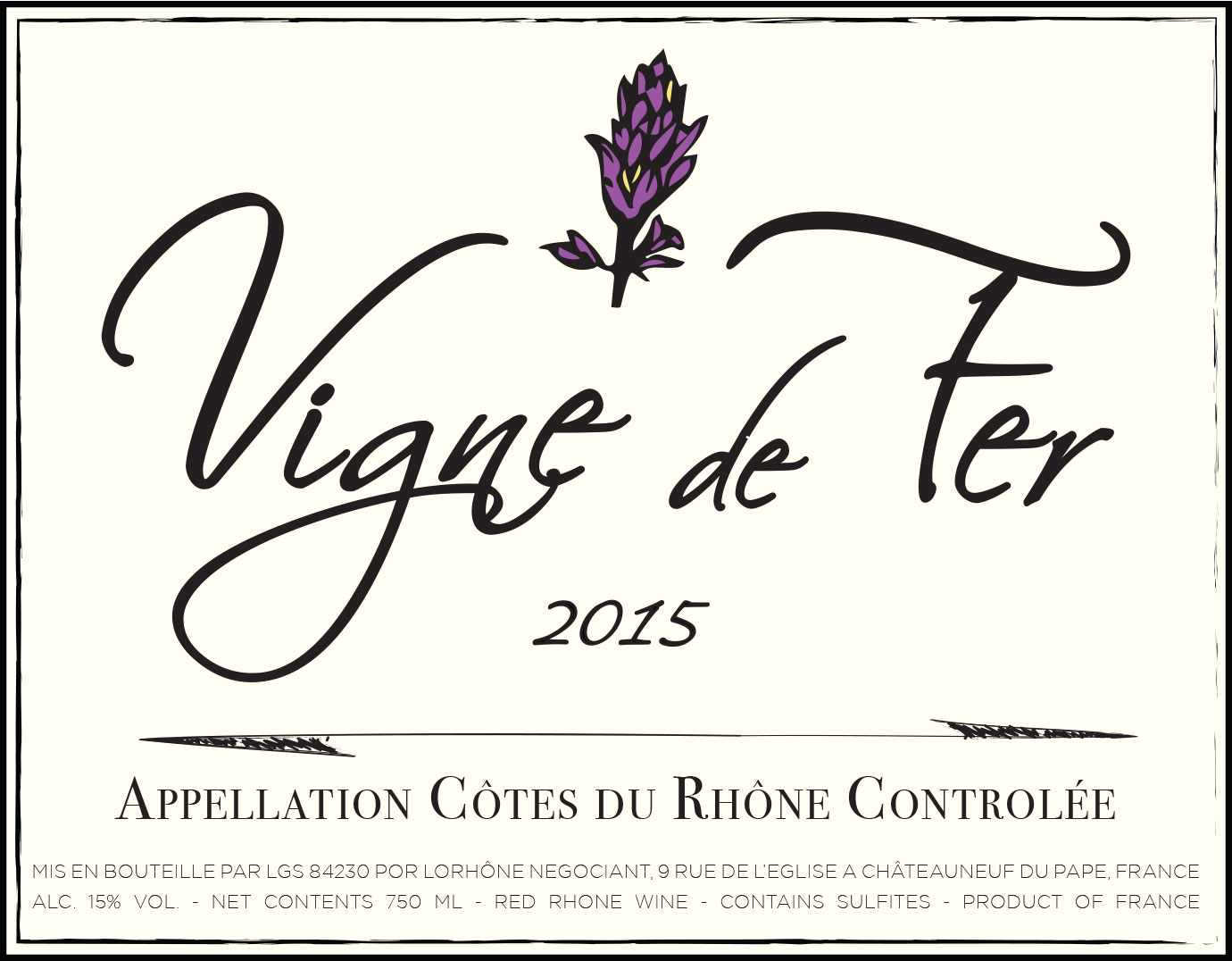
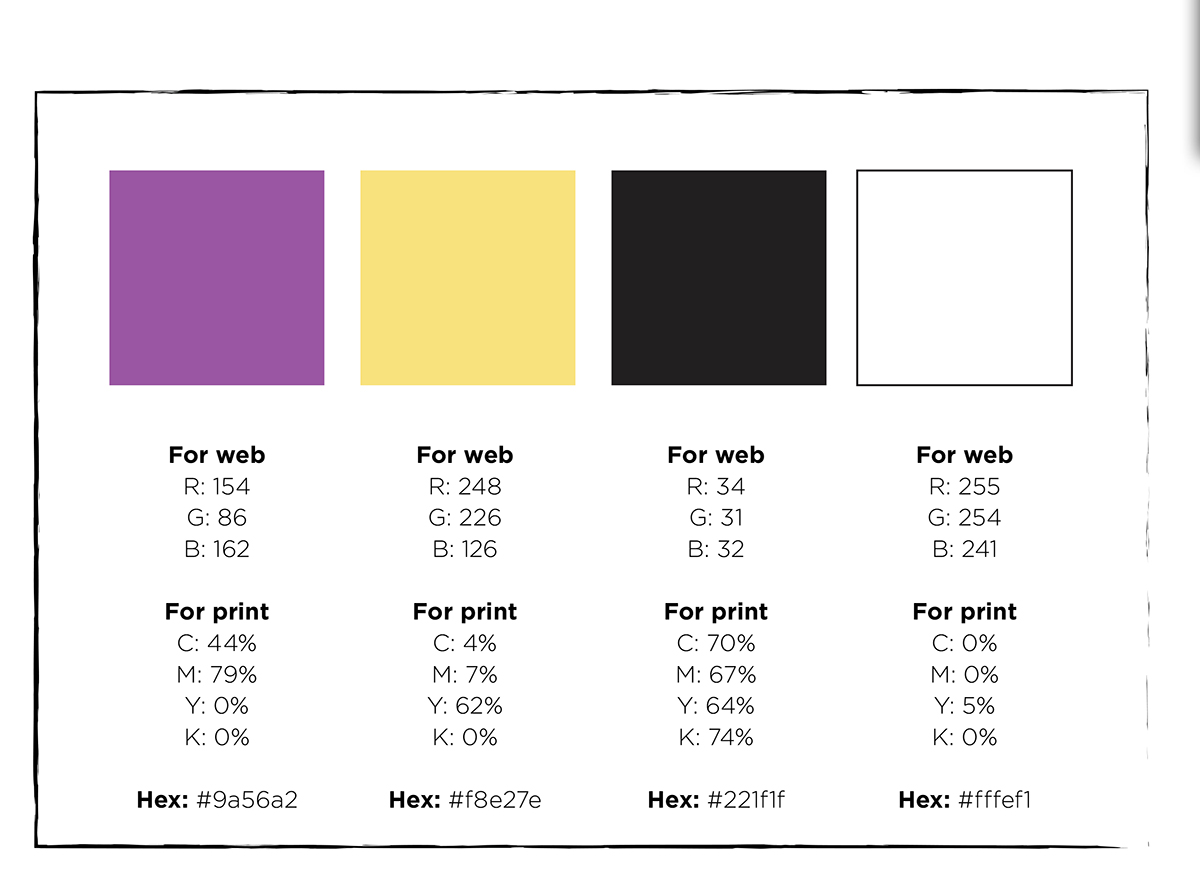
During the final stages of the revision process, the client wished to see some color in the thyme flower for some more visual appeal. Simplifying the flower to its most basic form and adding an appealing complimentary color balance was our primary objective.

